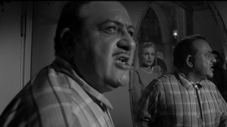
Recently, someone recommended me to watch Touch of Evil, a movie by Orson Welles released through Universal Studios in 1958. The version I watched is said to be a re-edit close to what the director envisioned. Watching this movie felt like a revelation. It's not a movie with well-groomed people on which everything is clean-cut and perfect. This film is gritty, actors look sweaty and tired, and carries a subplot revolving cultural diversity that very much resonates with real-life America.
There's a lot about this movie I liked. But it's not up to me to delve into character analysis and the social climate where the story unfolds. As a movie fan, however, I immersed myself in the opening scene. Very few things are as exciting as knowing something is going to happen. Anticipation can be nerve-wracking, and this movie benefits from it. Also, Marlene Dietrich, with her small part, is a spectacle all of her own. These days, as the term 'camera presence 'is thrown lightly, it doesn't hurt to take a look at old film stars like her to remember what' camera presence 'actually looks like. These are actors from a time when it feels they took their time to develop their character, and each shot was pre-meditated to save cost. What stood out to me the most in this movie, though, is the use of photography, which is credited to cinematographer Russell Metty. To read synopsis and learn more about this film, visit http://www.tcm.com/tcmdb/title/93695/Touch-of-Evil/
Touch of Evil was the fourth movie associated with Orsen Welles that I’ve seen. The first three were Citizen Ken, The Lady from Shangai, and The Third Man, so I anticipated a twisted story with dynamic cinematography. It’s incredible to realize how much a creative effort benefits from a simple execution. It seems that in movies, - like with anything else-, the better the technology, the larger the absence of clarity. Obviously, I refer to content, not technical clarity. Putting a show can only do so much for me; instead of things like CGI and pixel perfect imagery, I choose a straightforward approach to storytelling, like classic movies. In this post, I wish to explain what I enjoyed most about this movie’s photographic qualities.
Layering
Besides the use of the angle of view and high contrast between light and shadow, something else I was very responsive to was the use of layering. That is, the positioning of characters within a scene felt very intentional. In some scenes, I was conscious where the director wanted me to look and keep my attention on.
Sub Framing
Sub Framing is very present in this movie, adding scale, tension, and even humor. It also brings balance to dramatic scenes with a prevalence in dark shadows and low angles. The way sub-framing is used in this movie brings an allusion to surrealism through the use of reflections, lens distortion, and facial expressions.
